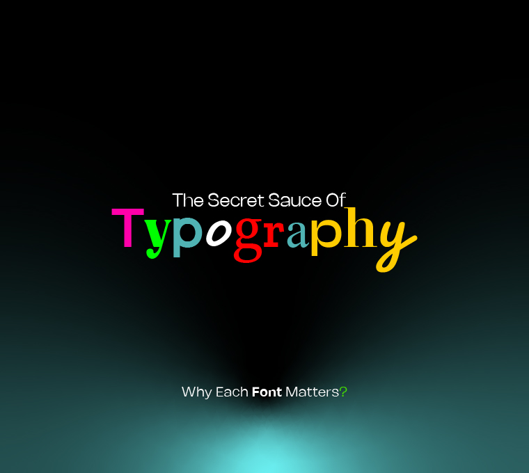
The Secret Sauce of Typography: Why Each Font Matters
Typography isn’t just about picking a random font from the list – it’s an art, a science, and, let’s be honest, the silent hero behind any piece of content. The font choice can make or break your design, much like how the right outfit can make you the party star. Whether you’re drafting a corporate brochure, a casual blog post, or a sassy Instagram caption, the font you choose speaks volumes, often before a single word is even read.
At Logical Showsha, we understand the power of fonts. Here’s why every font matters, with some examples. Ready to dive in? Let’s go!
1. Comic Sans: The Love It or Hate It Font
If fonts were people, Comic Sans would be the one who shows up at a formal event in a Hawaiian shirt – well-meaning but completely off the mark. Let’s face it: Comic Sans is the rebel of the typography world. If you used this in a professional newsletter, your readers might wonder if they’re attending a circus instead of reading a corporate update. But hey, it has its place in fun, casual spaces like kids’ parties or comic strips where the vibe is lighthearted and playful.
Tip: Don’t use Comic Sans in corporate communication unless you want to be the office clown (and not in a good way).
2. Times New Roman: The Old Reliable
Let’s be real – Times New Roman is like that trusty old black suit. It’s classic, safe, and screams “I mean business.” Perfect for formal documents, academic papers, or anything that needs to exude professionalism. It’s the font you’d wear to a board meeting when you want to be taken seriously, not to a beach party (unless your meeting happens to be at one, of course).
Tip: When in doubt, Times New Roman is your go-to. Just don’t overdo it – you don’t want to bore your audience.
3. Helvetica: The Cool Kid of Fonts
Helvetica is like that effortlessly cool person at a party who’s not trying too hard but still steals the spotlight. Clean, crisp, and super versatile, Helvetica is loved by designers for its modern feel and universal appeal. It’s perfect for tech startups, minimalist websites, and trendy brands that want to keep it sleek and professional.
Tip: Use Helvetica for websites or designs that need to scream “modern” without saying a word.
4. Arial: The Safe And Friendly Neighbor
Arial is like a friendly neighbor who always says “Hi” but never overstays their welcome. It’s the unsung hero of many design projects, especially when you want a sans-serif font that’s clean but not as serious as Helvetica. Arial is widely used in emails and presentations and is perfect for web content where readability is key.
Tip: Arial is great for body text – clean, easy to read, and always friendly.
5. Futura: The Minimalist’s Dream
Futura is for the person who thinks “less is more” – the minimalist who wants nothing extra. With its geometric shapes and sharp lines, it makes an impact without shouting for attention. Futura is a go-to for modern brands or creative projects requiring a futuristic vibe. It’s like the perfect pair of high-waisted pants: stylish, bold, and timeless.
Tip: Go for Futura when you want to evoke a sense of progress, and innovation, or simply make your design look chic.
6. Garamond: The Elegant Old Soul
Garamond is the font equivalent of a fine glass of red wine – refined, elegant, and full of characters. If you’re designing for a high-end brand, literature, or anything with a touch of classic elegance, Garamond is your best friend. It whispers sophistication, unlike the loud font cousins like Comic Sans or Arial.
Tip: Use Garamond for projects that need a touch of class and history. It’s perfect for books, invitations, and formal websites.
7. Bebas Neue: The Bold Statement Maker
Bebas Neue is like the Instagram influencer of fonts – big, bold, and unapologetic. It’s perfect for headers, posters, and any design element that needs to stand out. This font is all you need if you want to make a statement without saying a word. But beware, it’s not for the faint-hearted.
Tip: Use Bebas Neue for your most important headlines, but don’t overuse it – it’s meant to stand out, not take over.
Why Typography Matters for Your Brand
When designing for a brand, the right font can do wonders. It creates a visual personality, sets the tone, and establishes trust. Think of it this way: a font is like a first impression—it needs to hit the mark. Trust us; your customers will judge you based on it. A brand that uses a playful font when it should be serious might leave people scratching their heads, and a company that picks a heavy, serious font for something fun may come across as out of touch.
Font Strategy is Key
Whether you’re a design pro or just starting, understanding the impact of typography is essential. Choose wisely because fonts are far more than just text—they’re your design’s silent ambassadors and speak louder than you think.
At Logical Showsha, we understand the importance of every detail in design, including typography. Whether you’re creating a bold new brand identity or simply designing a logo or menu, we’re here to help you choose the perfect fonts for every project.
So, next time you’re about to hit send on that newsletter, ask yourself, “Would Comic Sans be the best choice?” And if you have to second-guess it, the answer is probably no.