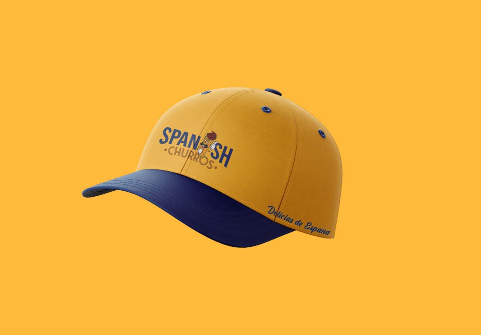
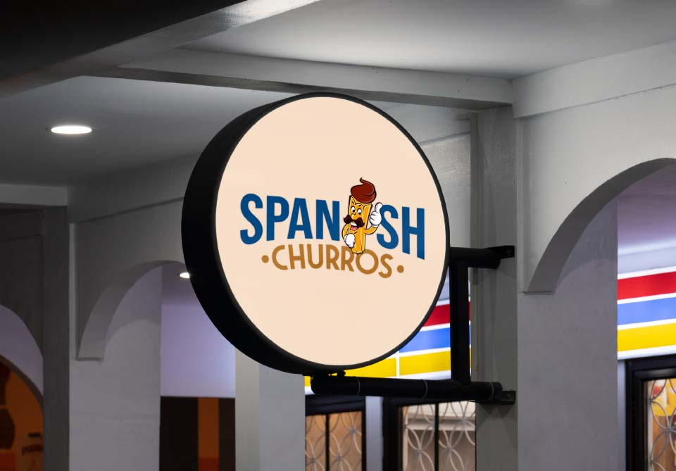
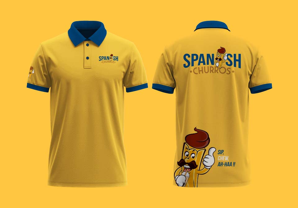
Spanish Churros is a vibrant and exciting brand that brings the authentic taste of churros to life with a modern twist. With a striking yellow and blue color palette, the brand captures the cheerful, energetic essence of Spain’s beloved street food. The colors not only evoke a sense of warmth and fun but also stand out, making Spanish Churros a memorable name in the world of indulgent treats.
Logical Showsha was instrumental in crafting the entire brand identity for Spanish Churros, from the logo to packaging. We designed a playful yet sophisticated logo that embodies the essence of the churro experience, with a thumbs-up gesture perfectly reflecting the brand’s positive and welcoming attitude. The packaging was thoughtfully created to enhance the brand’s personality, ensuring that every churro served feels like a delightful treat. We also designed the uniforms and merchandise, ensuring that each element aligned with the vibrant and fun vibe of the brand.
Through strategic creativity and attention to detail, Logical Showsha helped Spanish Churros stand out as a go-to destination for churro lovers, offering not only delicious snacks but a complete brand experience that brings joy to every bite.


