Perceived Luminance in Branding: Why Some Colors Pop More Than Others
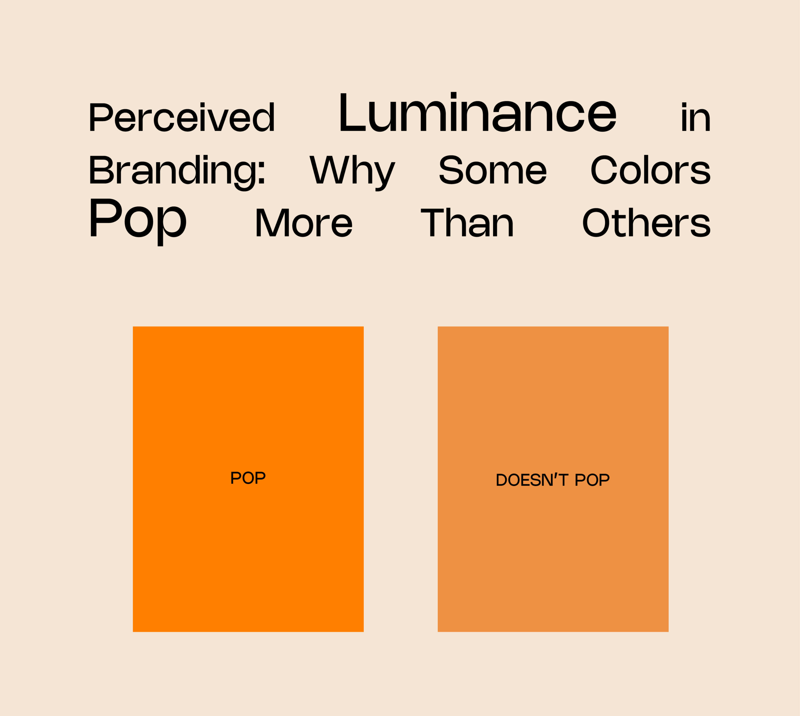
Walk into a supermarket aisle, and you’ll notice how your eyes naturally drift toward certain products. That bright yellow Lay’s packet, the deep red Coca-Cola can, or Starbucks’ signature green, they don’t just stand out by chance. They stand out because of perceived luminance, which is essentially how bright or visible a color appears to the human eye, regardless of its actual intensity. For example, yellow almost always appears lighter than other shades, making it instantly eye-catching, while red is known to create urgency and stimulate appetite.
Numbers back this up strongly. According to the Institute for Color Research, 90% of snap judgments about products are based on color alone. A study by Loyola University revealed that color improves brand recognition by up to 80%, showing just how vital it is for businesses to choose their palettes wisely. On the consumer behavior front, research indicates that shoppers make purchase decisions in under 7 seconds, which means visibility isn’t just an advantage, it’s survival. A product hidden in muted tones risks being overlooked, while a high-luminance shade can directly impact sales.
This principle extends to the digital world as well. Online, where attention spans are even shorter, the right color can make or break engagement. For instance, HubSpot reported that red call-to-action buttons increased conversions by 21% compared to less vibrant alternatives. That’s luminance psychology in real action—it guides not only what people notice but also what they act upon.
The mistake many brands make is choosing colors purely on personal taste or aesthetic appeal. A pastel lavender logo may look elegant on a mood board, but under harsh daylight or next to louder competitors, it risks fading into the background. Branding isn’t about picking a favorite color, it’s about understanding how the human eye perceives and prioritizes visual information.
At Logical Showsha, we combine design sensibility with behavioral psychology to create palettes that don’t just look good, but perform across contexts – packaging, signage, uniforms, and digital platforms. Because in branding, the real question isn’t just “Does it look good?” but “Will people see it, remember it, and choose it?”
In a market where color can influence up to 85% of buying decisions, the science of luminance is not just design, it’s strategy.