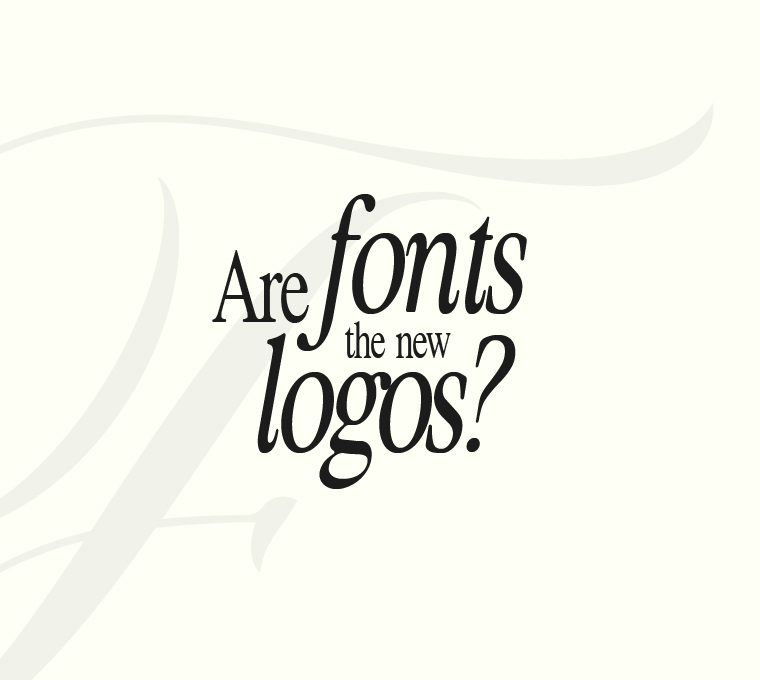
Are Fonts the New Logos?
Minimalism is no longer just a design aesthetic; it’s become the voice of modern branding. As brands move away from complex graphics and illustrative logos, typography driven branding is stepping into the spotlight, taking on the role of identity, tone, and memorability. In recent years, global names like Burberry, Balmain, and Yves Saint Laurent have stripped down their iconic logos and embraced clean, sans serif typography, signaling a shift in how brands want to be perceived as simple, sophisticated, and digitally adaptable.
This transition isn’t random; it reflects a larger shift in visual identity design. The digital era has made scalable logos, responsive design elements, and mobile first branding critical. Logos that once looked powerful in print struggled to retain impact on small screens. When Burberry unveiled its all caps minimalist wordmark in 2018, it wasn’t just a design update but a declaration of modern luxury made for the digital age. Google made a similar move in 2015, dropping its quirky serif in favor of a geometric sans serif that looked fresher, faster, and more in tune with user expectations.
Typography does more than just look good it communicates personality. A serif font whispers tradition and elegance, while a bold sans-serif shouts clarity and confidence. That’s why brands like Glossier have built entire identities on typography, using clean, lower-case wordmarks paired with neutral tones to feel intimate and modern. Dunkin’ took this even further when it dropped the “Donuts” from its name and reemerged with custom font branding, retaining familiarity while appealing to a younger, mobile savvy audience.
The surge in font-based logos aligns closely with events that reshaped the branding world. The introduction of Apple’s flat design in iOS7, the rise of UX-centric design, and the demand for cross platform consistency all made clean typography a strategic asset. Companies like Netflix and Airbnb invested in developing custom typefaces, Netflix Sans and Cereal, not just to save on licensing costs, but to create a unique brand language that works across every medium.
That’s not to say icons are extinct. The Nike swoosh and Apple’s bitten fruit still dominate globally. But these icons are now supported not overshadowed by the brand’s typography. New age creative agencies like Logical Showsha are embracing this shift by crafting identities where fonts do the heavy lifting. From logo design to brand decks, Logical Showsha focuses on how strategic typography, font psychology, and branding consistency can shape the overall customer perception, making type not just a visual but an emotional touchpoint. As branding continues to adapt to fast consumption, fonts are doing more than supporting logos; they are becoming the logos. In a scroll-fast, attention short world, modern font design, minimalist branding, and digital-first identity systems deliver clarity in milliseconds. A brand might not need a fancy graphic when its typeface already tells the story.