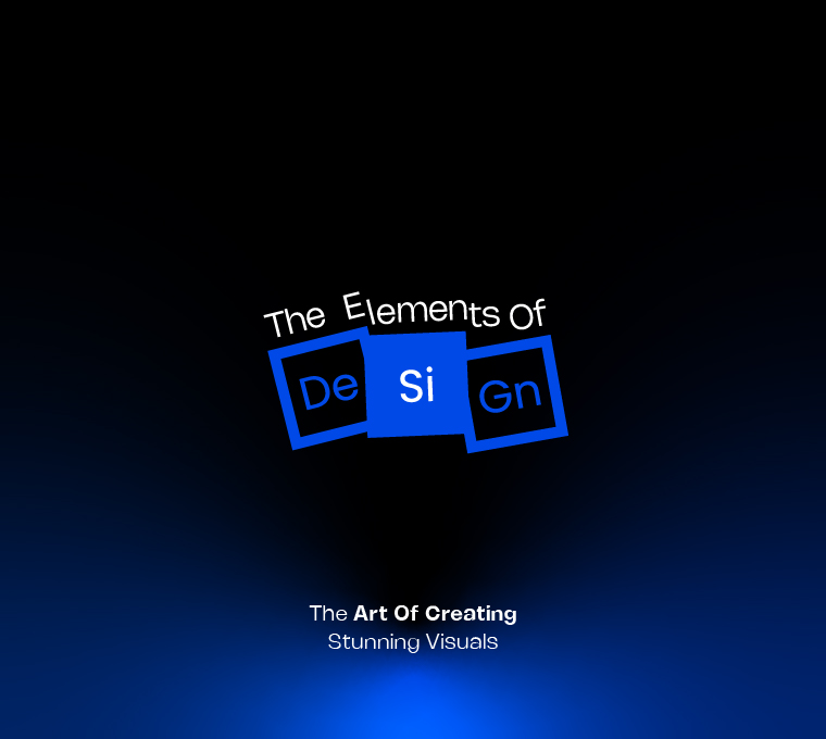
The Elements of Design: The Art of Creating Stunning Visuals
Ever looked at a design and thought, Wow, that just works? Or, on the flip side, seen something so chaotic that it gave you a headache? That’s the magic (or disaster) of design elements at play.
Great design isn’t just about picking fancy fonts or pretty colors—it’s about using fundamental principles that make things visually appealing, easy to understand, and impossible to ignore. And at Logical Showsha, we believe that good design is not just seen, but felt.
So, whether you’re crafting a logo, designing packaging, or curating an Instagram feed, understanding these elements of design will help you create visuals that wow, not wane. Let’s break them down—Logical Showsha style!
1. Line: The Ultimate Traffic Director
A line might sound basic, but it’s the backbone of any design. Lines guide the viewer’s eye, create movement, and define shapes.
Imagine This:
1. A law firm’s website using clean, straight lines = professional, structured, trustworthy.
2. A children’s toy brand using wavy, playful lines = fun, dynamic, and creative.
3. A luxury perfume ad with thin, delicate lines = elegance and sophistication.
Pro Tip: Use thicker lines for strength and dominance, thin lines for elegance, and dotted or broken lines for a creative edge.
2. Shape: The Silent Storyteller
Shapes aren’t just for geometry class—they’re everywhere in design. They create patterns, form brand identities, and evoke emotions.
Example:
1. Circles = harmony, unity (Think: Olympic ring)
2. Squares & Rectangles = stability, trust (Think: Banks, corporate logos)
3. Triangles = movement, energy (Think: Adidas, Google Drive)
Mind-Blowing Insight: Ever noticed how fast-food chains love rounded logos? That’s because circles make us feel comfortable and welcomed. Now you know why you crave fries whenever you see the golden arches!
3. Color: The Emotion Maker
We already covered color psychology in-depth [read here], but in design, color is the ultimate mood-setter. The right palette can make a brand look high-end, friendly, or even rebellious.
Quick Color Cheatsheet:
1. Red = Urgency, Passion (Use sparingly unless you’re running a boxing club)
2. Blue = Trust, Professionalism (Why do you think LinkedIn is blue?)
3. Yellow = Energy, Cheerfulness (Great for brands that want to be fun and youthful)
Pro Tip: Always consider contrast—a bold color with a neutral one makes your design pop without blinding your audience.
4. Texture: The Invisible Touch
Texture in digital design isn’t just about rough or smooth—it’s about how an element feels to the eyes. It adds depth, making designs more immersive and engaging.
Real-Life Example:
1. A matte texture in a luxury product design = elegance.
2. A grainy, grunge texture in a streetwear brand = raw, edgy.
3. A glossy texture in a cosmetics brand = modern, premium.
Fun Thought: Imagine a wedding invitation with a metallic gold effect—feels rich, right? Now, imagine that same invite in Comic Sans with a pixelated texture.Ouch.
5. Space: The Breath of Design
Ever seen a design that looks like someone crammed 100 things into one square inch? That’s a classic case of space starvation.
Space (or negative space) is like oxygen—it lets your design breathe and prevents it from looking cluttered.
Good Use of Space:
1. Apple’s minimalist branding (They let the product do the talking.)
2. High-end fashion labels (Ever noticed how luxury brands don’t overcrowd their designs?)
3. Websites that don’t give you a headache (Clean layouts keep visitors engaged.)
Designer Mantra: When in doubt, leave more space. Too much is better than too little!
6. Typography: The Silent Speaker
Fonts are like personalities—you wouldn’t wear Crocs to a black-tie event, so why use Comic Sans in a corporate report?
Font Psychology 101:
1. Serif Fonts (Times New Roman, Garamond): Traditional, trustworthy (Great for law firms, finance)
2. Sans-Serif Fonts (Helvetica, Montserrat): Modern, clean (Perfect for tech brands, startups)
3. Script Fonts (Lobster, Pacifico): Elegant, creative (Good for invitations, fashion brands)
Typography Horror Story: Imagine a luxury brand using Papyrus font. Suddenly, that expensive perfume looks like it belongs in a dollar store. Fonts matter!
7. Balance: The Perfect Symmetry (Or Not?)
Balance doesn’t mean everything has to be symmetrical—it just means the elements should work together in harmony.
Types of Balance:
1. Symmetrical Balance = Formal, stable (Used in corporate designs)
2. Asymmetrical Balance = Dynamic, modern (Used in edgy, creative designs)
Test It Yourself: Look at your design and squint. If something feels off, it probably is.
8. Contrast: The Showstopper
Contrast is what makes things stand out. It’s the difference between a striking design and something that blends into the background.
Ways to Use Contrast:
1. Color Contrast (Black & white = classic)
2. Size Contrast (Big, bold headlines + small subtext = engaging)
3. Shape Contrast (Sharp edges vs. soft curves = visual interest)
Example: Ever noticed how call-to-action buttons (like “BUY NOW”) are always in bright, high-contrast colors? That’s not by accident—it’s design psychology at work!
Final Takeaway: Design with Intention
Every masterpiece—whether it’s a stunning website, a killer logo, or an iconic brand—relies on these fundamental design elements. They aren’t just rules; they’re power tools to create impact, tell stories, and make brands unforgettable. At Logical Showsha, we don’t just design—we strategize, curate, and craft visuals that tell a brand’s story in a way that people feel. Whether it’s typography, color psychology, or balance, we know that the little details make the biggest difference.